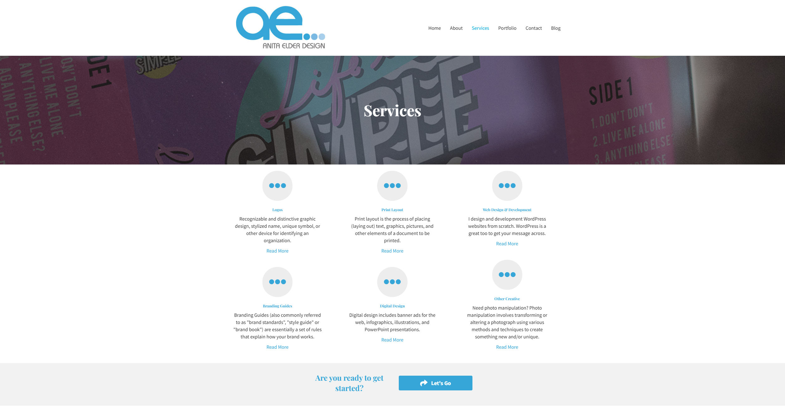
Anita Elder Design uses a consistant navigation menu throughout every page on the website.
Check out Anita Elder Design
Participation 9
Anita Elder Design uses a consistant navigation menu throughout every page on the website.
Check out Anita Elder Design
Schildbach's layout remains uncluttered by keeping plenty of space around the objects.
Check out Schildbach Design
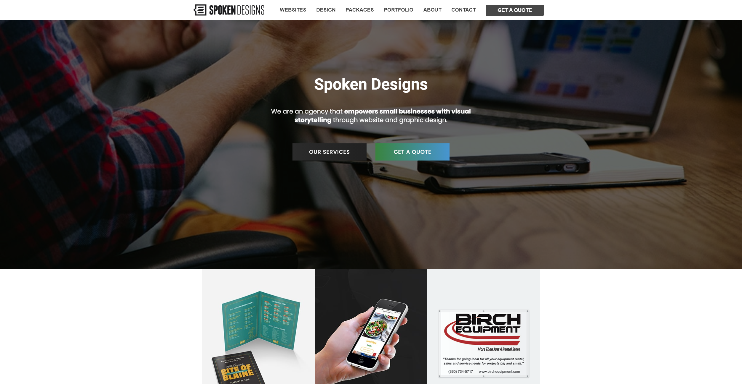
Spoken Designs is a great example for a call to action that is positioned perfectly.
Check out Spoken Designs
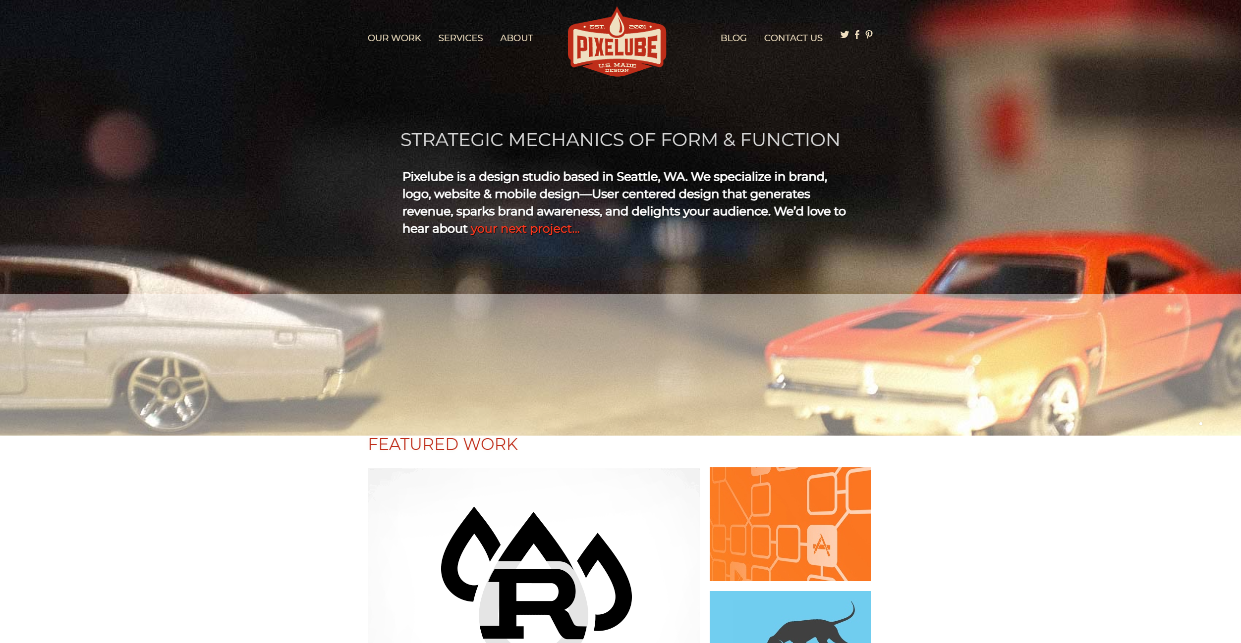
Pixelube's logo on the website leads the user back to the index page.
Check out pixelube
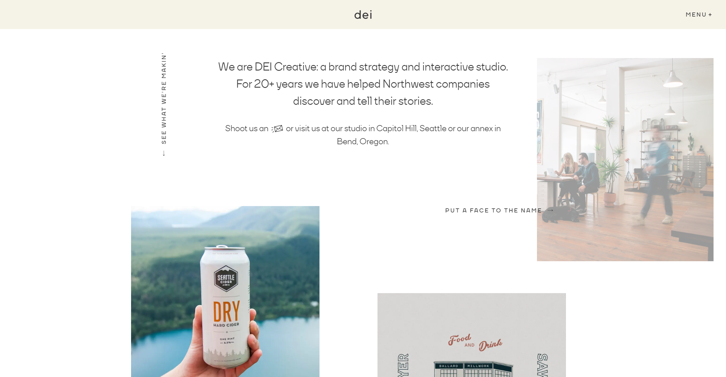
DEI Creative uses a mostly white backbround, but incorperates in color accents from their brand around the page.
Check out DEI
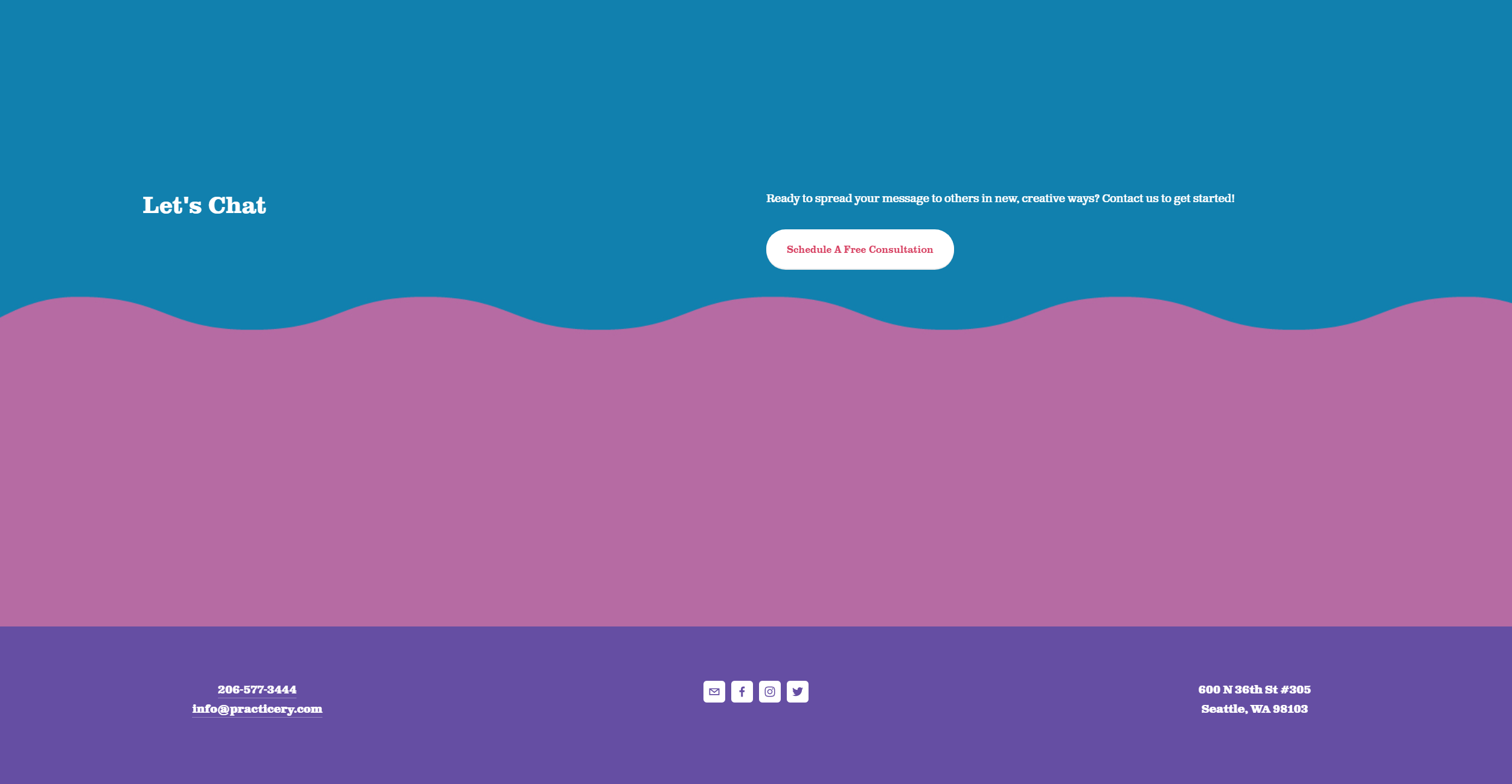
Practicery does not include a privacy policy in their footer, even though they collect our information.
Check out Practicery
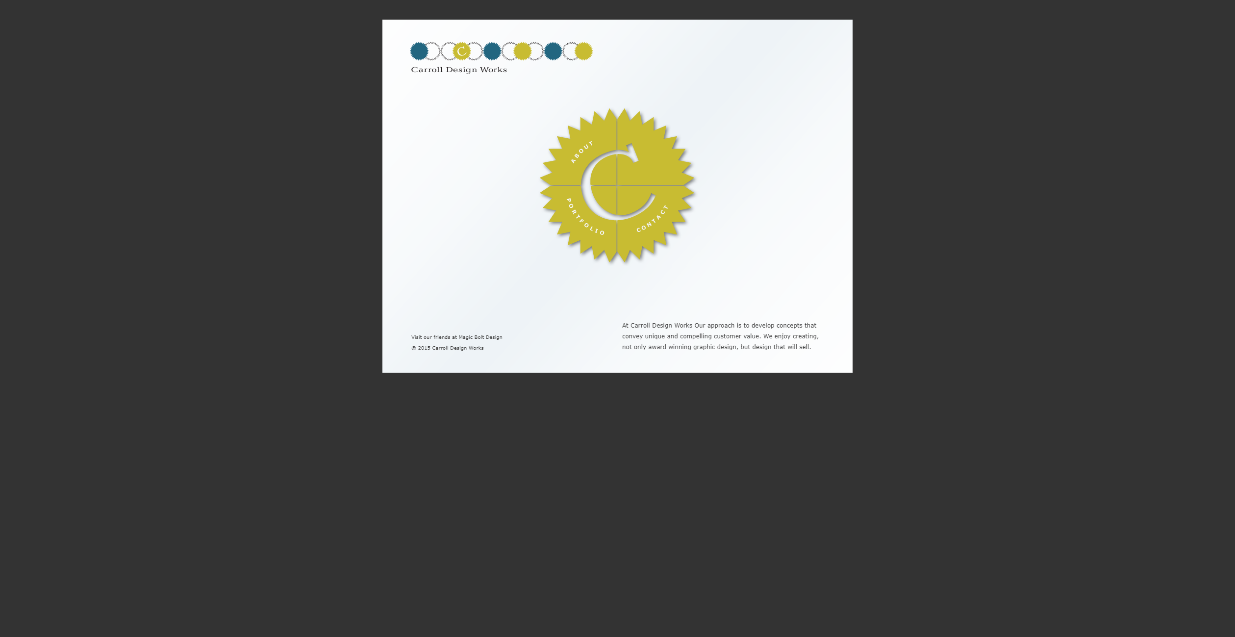
Carrol Design Works' Homepage is small and does not fill out the page great. It is also unresponsive with horizotal scrolling in mobile views.
Check out Carrol Design Works
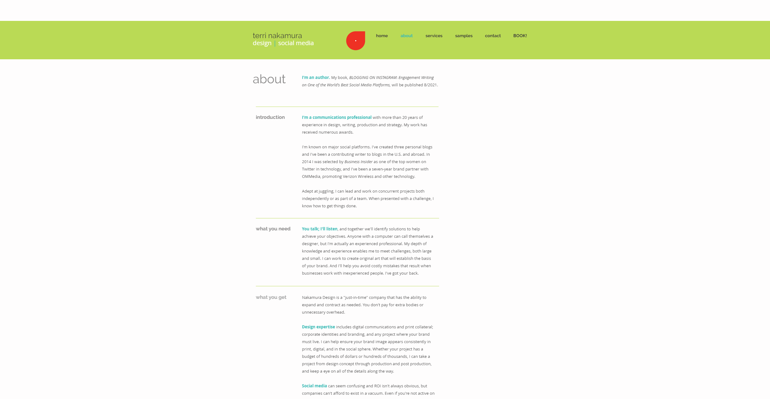
Terri Nakamura's name/logo on their page is clearly a hyperlink, but it does nothing when clicked.
Check out Terri Nakamura
Pudget Sound Illustration's homepage has no call to action. This prevents the user from knowing what to do next.
Check out pugetsoundillustrations
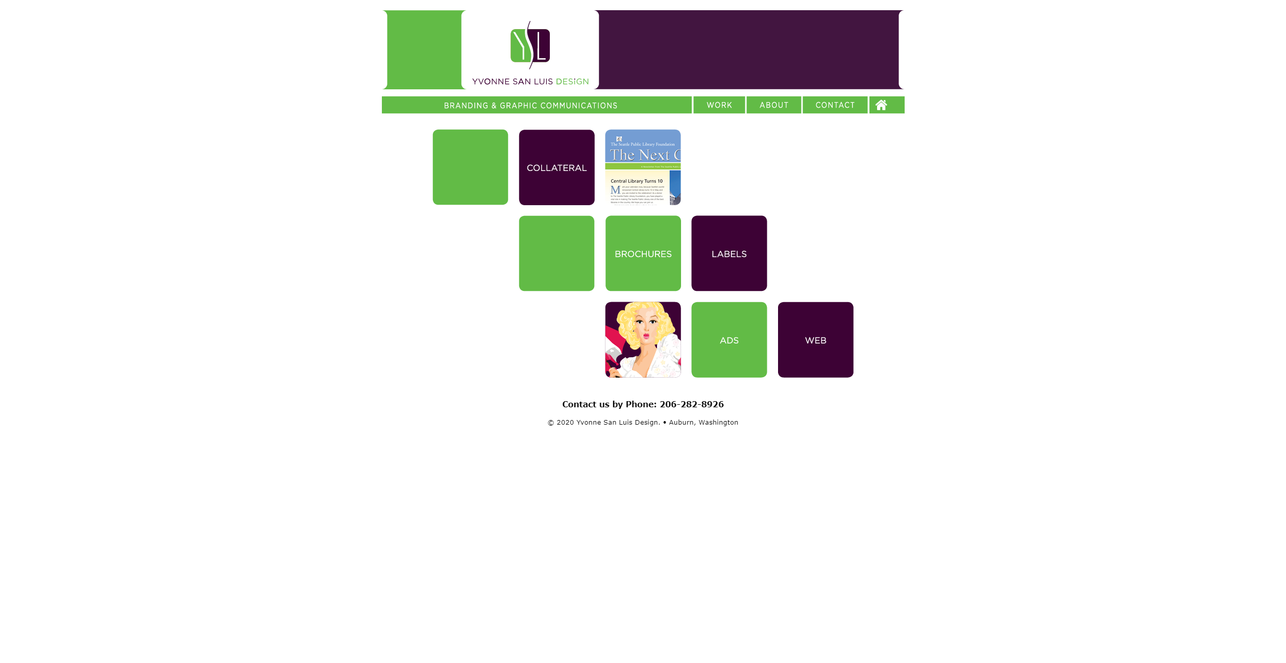
Yvonne San Luis' website has many objects that look like links or should be link, but are not links.
Check out Yvonne San Luis